Clever Spend started with a simple goal: help people feel more in
control of their money without overwhelming them.
I led the full product design process, from research and
wireframes to UI, dev, and even branding. I built a design
system to keep things consistent across 40+ screens and focused on
making complex data feel simple and helpful.
Responsibilities
Role
UX Designer
Timeline
June 2024 - Present
Team
1 UX Designer &
1 Developer
Tracking expenses across multiple categories can be overwhelming, especially without a clear financial overview. Budgeting tools are often complex, unintuitive, and lack features like automatic bank connections, making money management difficult.
The goal was to understand users' habits, challenges, and emotional triggers around managing personal finances, and what they truly need from a budgeting tool. I conducted 1:1 interviews with 5 users aged 28-55 to explore how they currently manage their finances, what stresses them out, and what they wish financial tools did better.
Key Insights
Key Actions
I analyzed 8 popular personal finance apps to understand their features, usability, and design patterns. This research helped identify gaps and opportunities, ensuring Clever Spend offers a simpler, more focused experience that stands out in the market.
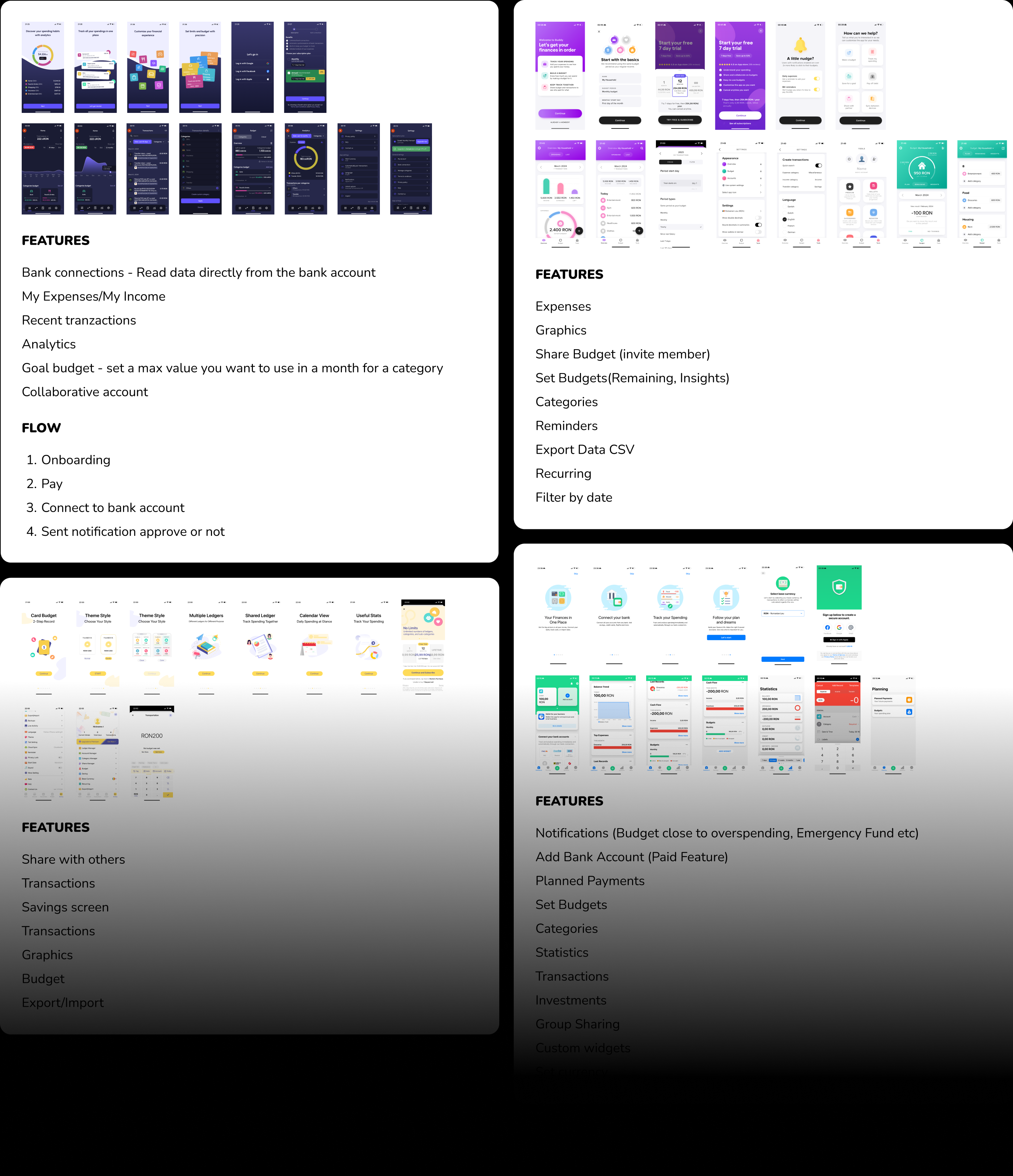
*To protect the integrity of the business, only a portion of the collected research is displayed.
Findings
I mapped out this information architecture to organize the main sections of Clever Spend. It helped shape the navigation and group features in a way that feels clear and easy to follow for users.
My approach to wireframes was focused on speed, clarity, and early collaboration. I used them to explore ideas quickly, identify usability issues, and align with developers before committing to high-fidelity design.
I created a shared design system that served as a single source of truth for both designers and developers. It included colors, spacing, typography, and components. This helped ensure visual consistency, simplified handoff, and sped up development.
Yep — I did it all. From the logo and branding to the full UI and design system. I wanted the product to feel clean, trustworthy, and just a little bit friendly (because budgets are scary enough).
I was responsible for building all the app's user interfaces in React Native, focusing on creating reusable and scalable components. This ensured a consistent and efficient development process across the app.
Profile Circle Component
<View style={profileCircleStyles.container}>
<View style={profileCircleStyles.circle}>
{isStringDefined(initials) ? (
<Text
style={[
textStyle.headingH1,
profileCircleStyles.initials,
]}
>
{initials}
</Text>
) : (
<ProfileIcon
width={ICON_SIZE_XXL}
height={ICON_SIZE_XXL}
/>
)}
</View>
<Text style={[textStyle.headingH2, profileCircleStyles.name]}>
{displayName}
</Text>
</View>
import { StyleSheet } from 'react-native';
import { COLORS } from 'constants/colors';
import { VIEW } from 'constants/views';
const { MARGIN_8 } = VIEW;
export const profileCircleStyles = StyleSheet.create({
container: {
alignItems: 'center',
},
circle: {
width: 100,
height: 100,
borderRadius: 100,
backgroundColor: COLORS.primaryAccentGreen,
alignItems: 'center',
justifyContent: 'center',
},
initials: {
color: COLORS.lightSurfaceTextPrimary,
},
name: {
marginTop: MARGIN_8,
color: COLORS.lightSurfaceTextPrimary,
textAlign: 'center',
},
});
This project wasn't smooth sailing, but it gave me the chance to take
a product from idea to execution. Some users didn't understand how to
record transactions to savings or debts. Some flows didn't make sense
from a dev perspective. And the final UI? That took at least three
iterations before it finally felt right.
Nothing about this process was perfect, but it was iterative,
honest, and focused. In the end, I shipped a functional MVP that
solves real problems. There's still room for improvement, but for now,
this is a solid first step. And that's what matters.